
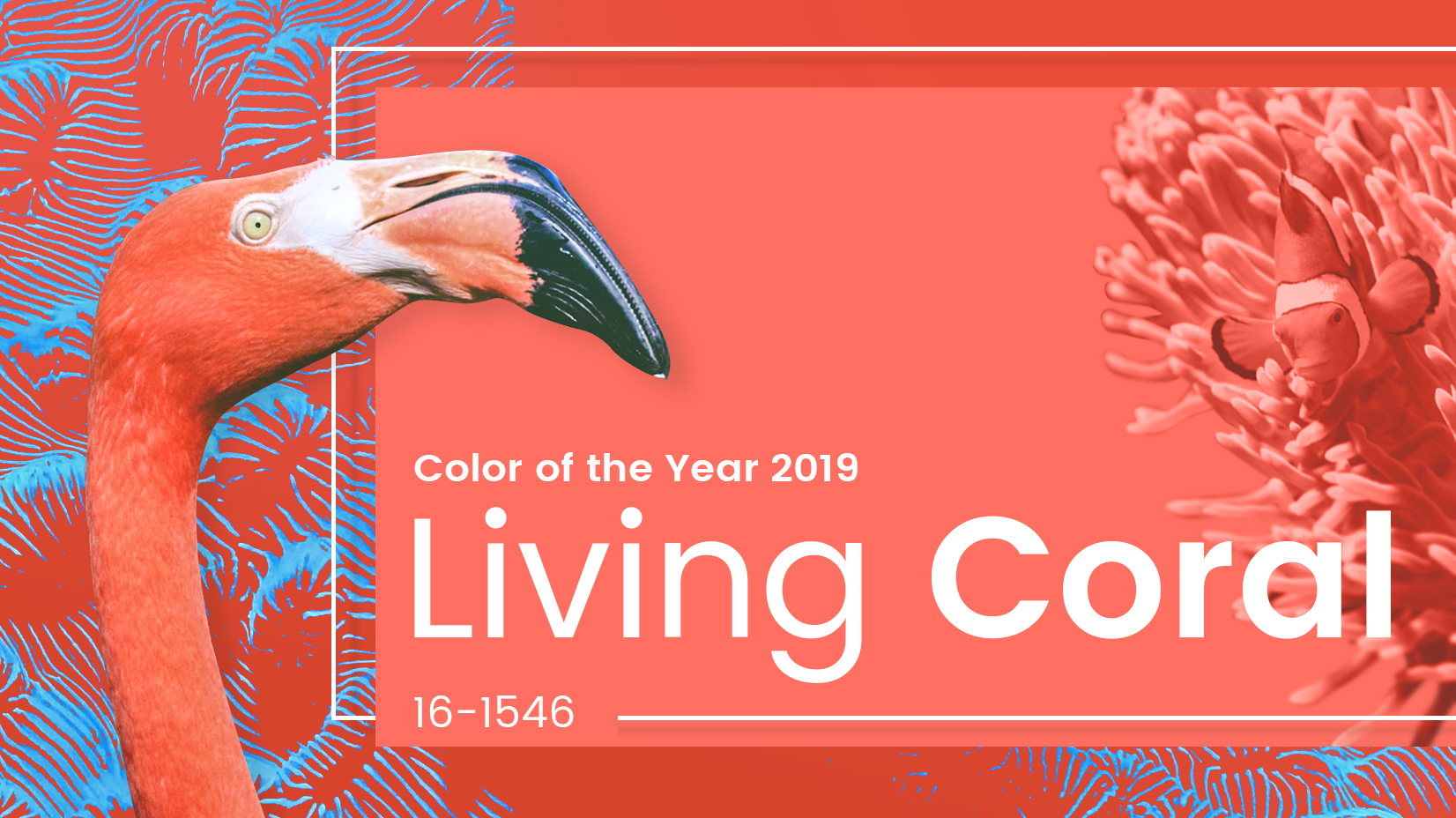

I must admit, when I read that Pantone had announced Living Coral as it’s colour of the year for 2019, I had a bit of a groan to myself; but let’s back up a bit.
Each year, around December, Pantone announces it’s ‘Colour of the Year’ for the following year, a prediction of one colour that will influence designers of all walks of life: interiors, fashion, art, beauty, even packaging. You name it, you will start to notice that particular colour everywhere. For 2018 the colour was Ultra Violet, and you may recall how popular a colour purple was last year.

But why the grumbling? I could see the colour applied to fashion, beauty, art, graphic design. Interiors however, surely it would look childish or kitchy? (and this is coming from someone who loves pink in all it’s forms!)
I couldn’t see how I could use it in a modern or sophisticated way – until I started researching.

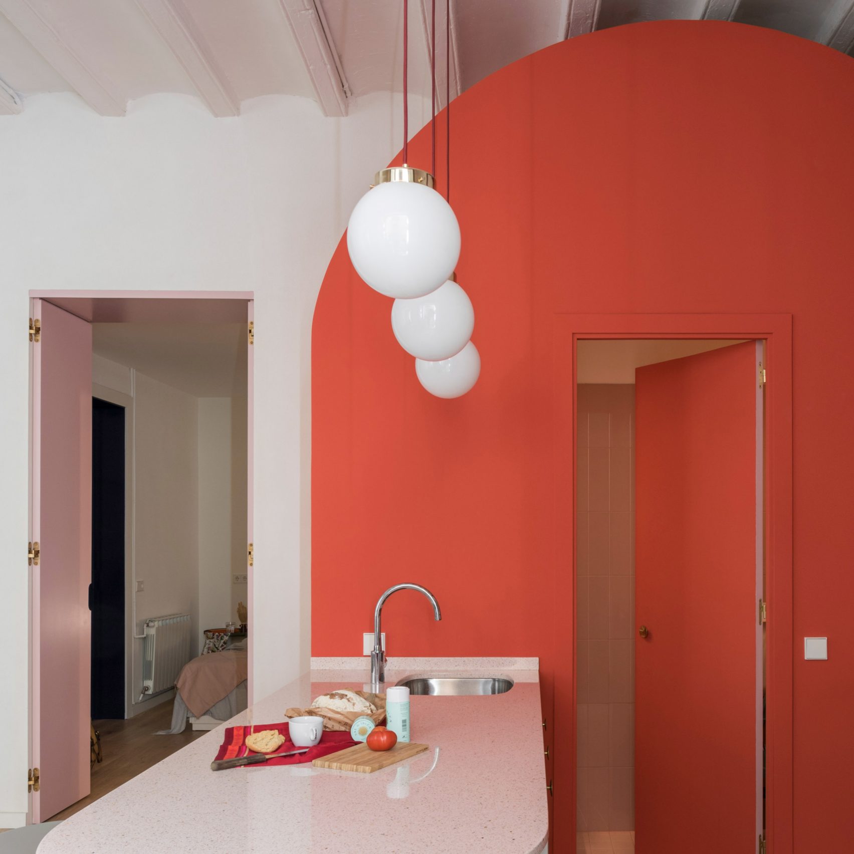
This bathroom was the first image I found and I was in love, it’s somehow retro and futuristic simultaneously, just a gorgeous combination.
Look at the warmth and joy this shade gives a room, it would be nearly impossible to be unhappy in this bathroom.

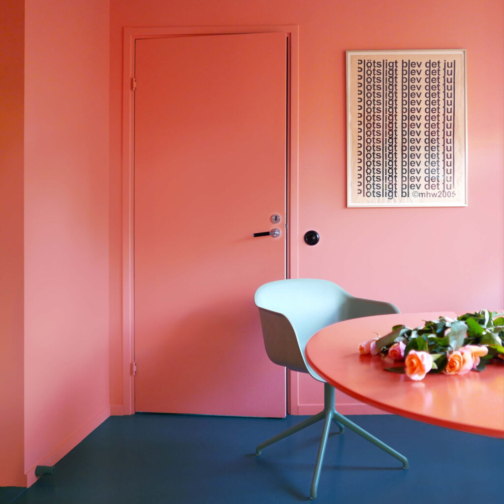
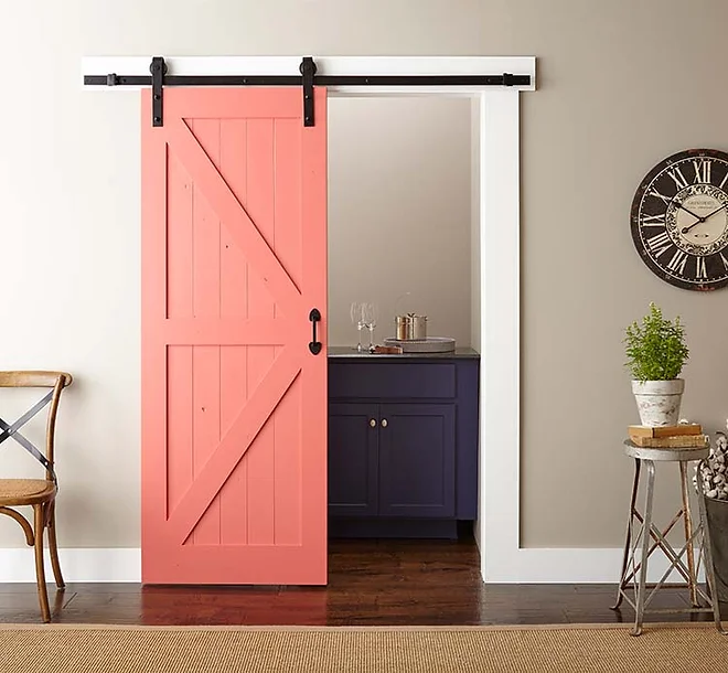
Dulux ‘Coral Oasis’ is a stunning coral colour for an accent wall – or even a whole room for the brave!


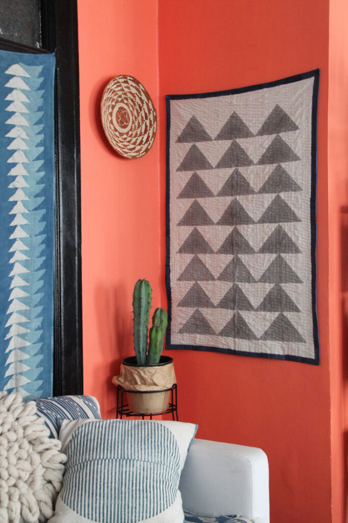
This colour is particularly impactful when teamed with intense blues, such as Prussian Blue or Ultramarine. Think of the colour wheel when choosing complimentary colours: If your coral leans more pink, you’ll want a blue with a hint of green and if your coral is more on the orange side, you’ll want more of an Ultramarine (with a hint of violet).
Couches in this shade are also beautiful for a pop of vibrant colour to add a focal point to the room, but still consider how this will effect surrounding colours. A coral couch would be best in a room painted in a cool white, as to maintain that complimentary relationship.

Also remember, if you choose a muted coral, surrounding pieces will look best with similar softness (a harmony of saturation).
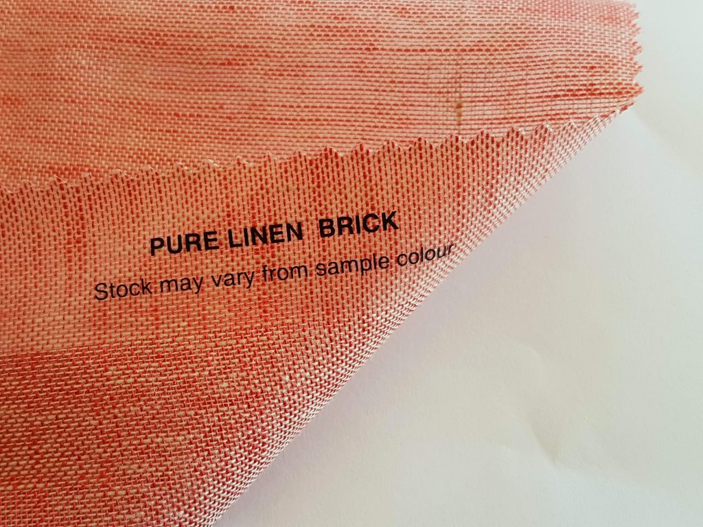
Why not consider upholstering your couch or chairs in a sumptuous coral velvet such as the Tiffany from Trabeth Textiles in either 945 Pink Lily or 948 Peony (6th and 7th from top right), these would even make beautiful cushions!

Or why not update some dated furniture with a coat of paint? This is an easy DIY that can transform your decor.
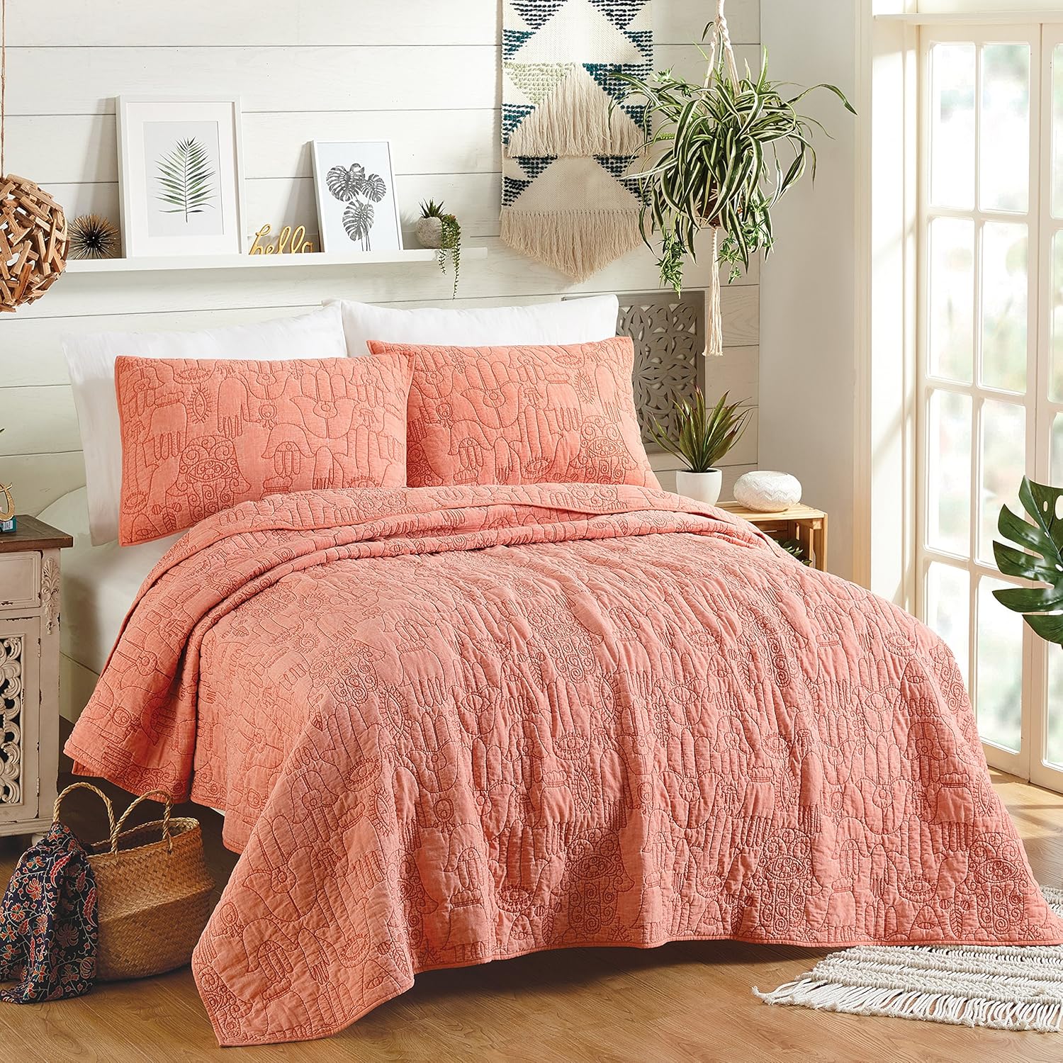
There is an abundance of textiles in this colour family, these are great made into curtains, cushions or wall hangings to brighten your space.
If you don’t want to make a huge commitment to the colour, but still want to dip your toe in the trend, you can easily add smaller decor items that can be easily changed out as trends progress.
For those that are super committed, why not even apply this colour in your sheers for a bold statement


If you’d like to use any of these fabrics or colours in your home, please come and have a chat, we would be happy to discuss options with you!

Recent Comments